Model Performance Evaluation
- 강의자료 다운로드: Not ready yet
Introduction
In machine learning, building a predictive model is only half of the journey. The other half is to evaluate how well that model performs — not only on the training data but also on new, unseen data.
Model evaluation allows us to check whether our model has generalized properly or is simply memorizing (overfitting) the training samples. A good model should balance between fitting the training data and maintaining predictive power on new data.
What does “Generalized Properly” mean?
Generalization refers to a model’s ability to perform well on unseen data drawn from the same distribution as the training set. A well-generalized model captures the underlying patterns in the data rather than memorizing the specific details or noise within the training examples.

Key characteristics of a generalized model:
-
Performs consistently on training, validation, and test sets.
-
Does not rely on memorizing specific samples or random noise.
-
Exhibits stable performance across different data splits and random seeds.
-
Maintains robustness even when slight variations occur in the input.
How to promote generalization:
-
Use cross-validation to evaluate stability across folds.
-
Apply regularization (e.g., L1, L2 penalties, dropout, early stopping).
-
Increase data diversity through augmentation or collection of more samples.
-
Prefer simpler architectures or fewer model parameters to reduce variance.
-
Avoid data leakage, which happens when test data information leaks into training.
What is Overfitting (and why it matters)?
Overfitting occurs when a model learns patterns that are too specific to the training data, including random fluctuations or noise, resulting in poor performance on new data. This often means the model has high training accuracy but low validation/test accuracy, indicating poor generalization.

Common causes of overfitting:
-
Model complexity too high for the dataset (deep networks, high-degree polynomials).
-
Small training set size or unrepresentative data.
-
Lack of regularization or excessive training epochs.
-
Data leakage during preprocessing or feature engineering.
How to detect overfitting:

-
A large gap between training and validation errors.
-
Training accuracy continues to increase while validation accuracy stagnates or decreases.
-
High variance in cross-validation results across folds.
Ways to reduce overfitting:

-
Simplify the model architecture or reduce the number of parameters.
-
Use regularization techniques such as weight decay, L1/L2 penalties, or dropout.
-
Employ early stopping when validation loss stops improving.
-
Collect or augment more data to provide diverse examples.
-
Apply proper validation strategy (train/validation/test split, stratified sampling).
A good machine learning model should generalize properly — capturing essential data patterns — while avoiding overfitting, which means memorizing irrelevant noise.
Objectives of model evaluation:
-
Measure how accurately a model predicts outcomes
-
Compare different models quantitatively
-
Identify overfitting or underfitting behavior
-
Support model selection and hyperparameter tuning
Metrics in Classification and Regression
When evaluating models, the type of metric used depends on the type of problem — whether it is classification or regression.
Metrics provide a quantitative way to judge how well a model performs, guiding model selection, optimization, and improvement.
Classification Metrics
Classification problems deal with categorical outputs — for example, predicting whether an email is spam or not spam, or whether a patient is sick or healthy. To assess a classifier’s performance, we use various metrics that describe how well it separates the classes.
Classification metrics help ensure that the model not only predicts correctly but also balances false positives and false negatives according to the problem’s real-world cost.
Confusion Matrix
A Confusion Matrix summarizes prediction results on a classification problem. It compares the actual target values with the model’s predictions, providing a clear picture of where the model gets confused.
| True Class | |||
|---|---|---|---|
| Positive | Negative | ||
|
Predicted Class |
Positive |
True Positive (TP) |
False Positive (FP) |
Negative |
False Negative (FN) |
True Negative (TN) |
|
Explanation:
-
True Positive (TP): Model correctly predicts the positive class.
-
False Positive (FP): Model incorrectly predicts positive (a false alarm).
-
False Negative (FN): Model fails to identify a positive case (a miss).
-
True Negative (TN): Model correctly predicts the negative class.
Example 1. Medical Diagnosis (Cancer Detection)
| Predicted / True Class | Positive (Cancer) | Negative (Healthy) |
|---|---|---|
| Positive (Predicted Positive) | True Positive (TP) Correctly detects cancer patient |
False Positive (FP) Healthy person misclassified as cancer |
| Negative (Predicted Negative) | False Negative (FN) Cancer patient missed by model |
True Negative (TN) Correctly detects healthy person |
Insight:
In medical diagnosis, FN (False Negative) is the most dangerous — missing a real patient.
The model must prioritize Recall (Sensitivity) even at the cost of lower Precision.
Example 2. Spam Detection (Anti-virus Engine)
| Predicted / True Class | Spam | Not Spam |
|---|---|---|
| Positive (Predicted Spam) | True Positive (TP) Spam email correctly identified |
False Positive (FP) Important email marked as spam |
| Negative (Predicted Not Spam) | False Negative (FN) Spam missed and delivered to inbox |
True Negative (TN) Normal email correctly delivered |
Insight:
Too many FPs lead to user frustration (lost legitimate emails).
Too many FNs reduce spam filtering effectiveness.
Balance Precision and Recall according to user tolerance.
Example 3. Pedestrian Detection (Smart Car)
| Predicted / True Class | Pedestrian | No Pedestrian |
|---|---|---|
| Positive (Predicted Pedestrian) | True Positive (TP) Pedestrian correctly detected |
False Positive (FP) Vehicle stops for non-existent pedestrian |
| Negative (Predicted No Pedestrian) | False Negative (FN) Pedestrian not detected (dangerous) |
True Negative (TN) Correctly ignores empty road |
Insight:
In safety-critical AI systems, False Negatives (FN) are unacceptable.
It’s better for the model to err on the side of caution — slightly higher FP is tolerated
if it ensures human safety and reduces risk of collision.
Python Example
# Example: Building and Visualizing a Confusion Matrix
from sklearn.metrics import confusion_matrix
import seaborn as sns
import matplotlib.pyplot as plt

# True labels and predicted labels
y_true = [1, 0, 1, 1, 0, 1, 0]
y_pred = [1, 0, 1, 0, 0, 1, 1]

# Compute the confusion matrix
cm = confusion_matrix(y_true, y_pred)
print("Confusion Matrix:\n", cm)

# --- Visualization ---
plt.figure(figsize=(5, 4))
sns.heatmap(cm,
            annot=True,        # display numbers
            fmt='d',           # integer format
            cmap='Blues',      # color map
            cbar=True,         # show color bar
            xticklabels=['Predicted Negative', 'Predicted Positive'],
            yticklabels=['True Negative', 'True Positive'])

plt.title("Confusion Matrix Visualization", fontsize=14, pad=10)
plt.xlabel("Predicted Class")
plt.ylabel("True Class")
plt.tight_layout()
plt.show()
Output
[[2 1]
 [1 3]]
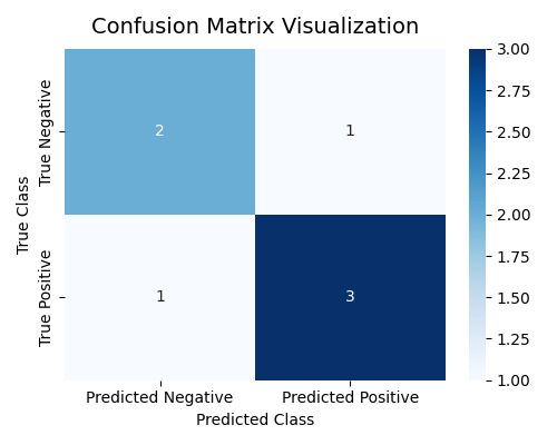
Here, the model made:
-
3 correct positive predictions (TP = 3)
-
2 correct negative predictions (TN = 2)
-
1 false positive (FP = 1)
-
1 false negative (FN = 1)
Accuracy, Precision, Recall, and F1-Score

Each metric gives a different perspective on model performance.
| Metric | Formula | Meaning |
|---|---|---|
| Accuracy | \(\dfrac{TP + TN}{TP + TN + FP + FN}\) | Overall correctness of predictions |
| Precision | \(\dfrac{TP}{TP + FP}\) | How many predicted positives are actually positive |
| Recall (Sensitivity) | \(\dfrac{TP}{TP + FN}\) | How many actual positives are correctly detected |
| F1-Score | \(2 \times \dfrac{Precision \times Recall}{Precision + Recall}\) | Balance between Precision and Recall |
In machine learning classification tasks, a single number (like accuracy) is rarely enough to understand how well a model performs. Each metric — Accuracy, Precision, Recall, and F1-Score — tells a different story about model behavior and should be interpreted in the context of the problem.
Accuracy — Overall Correctness
Accuracy measures how often the model predicts correctly among all predictions.
-
Meaning: It represents the proportion of correct predictions (both positive and negative) out of all samples.
-
When to Use: Useful when classes are balanced, i.e., when both positive and negative samples occur in roughly equal amounts.
-
Strengths:
-
Easy to understand and interpret.
-
Provides a quick general view of performance.
-
-
Limitations:
-
Misleading in imbalanced datasets.
-
For example, in a medical test where only 1% of patients are sick, predicting “healthy” for everyone gives 99% accuracy but fails to identify any patient.
-
Doesn’t show which class is being misclassified.
-
Precision — Quality of Positive Predictions
Precision focuses on how many predicted positives are truly positive.
-
Meaning: Of all samples predicted as positive, how many were actually positive.
-
When to Use: Important in applications where false positives are costly. Example: Spam detection — marking a legitimate email as spam (FP) is worse than missing one spam message.
-
Strengths:
-
Ensures model predictions are trustworthy.
-
Reduces risk of over-alerting in sensitive systems.
-
-
Limitations:
-
Doesn’t consider missed positive cases (FN).
-
If the model plays it too safe and predicts fewer positives, precision can look high even though recall is poor.
-
Recall (Sensitivity) — Ability to Find Positives
Recall measures how many actual positives are correctly identified.
-
Meaning: Of all the truly positive samples, how many did the model successfully detect.
-
When to Use: Critical in situations where missing a positive case is very costly or dangerous. Example: Medical diagnostics or fraud detection — missing a sick patient (FN) or a fraudulent transaction could be catastrophic.
-
Strengths:
-
Ensures important cases are not missed.
-
Good for safety-critical applications.
-
-
Limitations:
-
May increase false positives if the model becomes too sensitive.
-
Alone, it doesn’t indicate overall prediction quality.
-
F1-Score — Balance Between Precision and Recall
The F1-score is the harmonic mean of Precision and Recall, balancing both aspects. Unlike the arithmetic mean, which can be overly influenced by large values, the harmonic mean ensures that both Precision and Recall must be high to achieve a high F1-score.
If either Precision or Recall is low, the harmonic mean sharply decreases — making F1 a strict and fair measure of balanced performance.
-
Meaning: It provides a single value that balances the trade-off between Precision and Recall, reflecting how well the model maintains both accuracy in positive predictions (Precision) and completeness in detecting positives (Recall).
-
When to Use: Useful when you need to balance both false positives and false negatives. Example: Information retrieval, medical screening, or fraud detection systems.
-
Strengths:
-
Uses harmonic mean, which punishes models that have one metric much lower than the other.
-
Effective for imbalanced datasets.
-
Provides a more comprehensive measure than accuracy alone.
-
-
Limitations:
-
Doesn’t differentiate the cost between FP and FN.
-
May hide details of model behavior if interpreted without context.

-
Python Example
pip install scikit-learn
# Example: Evaluating classification metrics
from sklearn.metrics import accuracy_score, precision_score, recall_score, f1_score

# True and predicted labels
y_true = [1, 0, 1, 1, 0, 1, 0]
y_pred = [1, 0, 1, 0, 0, 1, 1]

# Calculate metrics
acc = accuracy_score(y_true, y_pred)
pre = precision_score(y_true, y_pred)
rec = recall_score(y_true, y_pred)
f1 = f1_score(y_true, y_pred)

# Display results
print(f"Accuracy: {acc:.2f}")
print(f"Precision: {pre:.2f}")
print(f"Recall: {rec:.2f}")
print(f"F1-Score: {f1:.2f}")
실행 결과
Accuracy: 0.71
Precision: 0.75
Recall: 0.75
F1-Score: 0.75
-
Accuracy (
0.71): Suitable when classes are balanced. -
Precision (
0.75): Important when false positives are costly (e.g., spam detection). -
Recall (
0.75): Critical when missing positives is dangerous (e.g., medical diagnosis). -
F1-Score (
0.75): Provides a balanced view of Precision and Recall, ideal for imbalanced data.
ROC Curve and AUC
Sensitivity (민감도, Recall)
-
Meaning: The proportion of actual positive cases that the model correctly identifies.
-
Formula: \(\frac{TP}{TP + FN}\) (exactly same as
Recall) -
Focus: Ability to detect true positives without missing them.
-
Example: In medical diagnosis, it measures how many sick patients are correctly detected.
-
Origin: The term "sensitive" refers to reacting easily to signals --- a sensitive model reacts strongly to true positives.
Specificity (특이도, 1 - FPR)

-
Meaning: The proportion of actual negative cases correctly identified as negative.
-
Formula: \(\frac{TN}{TN + FP} = 1 - \frac{FP}{FP + TN} = 1 - FPR\)
-
Focus: Avoiding false alarms or false positives.
-
Example: In spam filtering, it measures how well normal emails are kept out of the spam folder.
-
Origin: "Specific" means reacting only to what is truly positive --- the model ignores irrelevant cases.
What is ROC (Receiver Operating Characteristic)?
The ROC curve visualizes how a binary classifier performs as the decision threshold changes. It helps us understand the trade-off between detecting positive samples (sensitivity) and avoiding false alarms (specificity).
- X-axis: False Positive Rate
- Y-axis: True Positive Rate
As we lower the threshold, more samples are classified as positive
-
TPR increases (we catch more positives),
-
but FPR also increases (we make more mistakes).
Each point on the ROC curve represents one possible threshold. By connecting all these points, we get the ROC curve, which shows the full spectrum of model performance.
| Region | Meaning |
|---|---|
| Top-left corner | Ideal region (high TPR, low FPR) — a good model stays near here |
| Diagonal line | Random guessing line (no discrimination) |
| Below diagonal | Worse than random (model predictions are reversed) |
How to Calculate ROC Curve?
We will explore how the ROC curve is computed by changing the decision threshold step by step.
We will focus on understanding the underlying mechanism without relying on Python code.
Step 1. Dataset with Toy Example
Suppose we have a simple binary classification model that outputs a probability score (between 0 and 1) for each sample, indicating how likely it is to belong to the positive class.
| Sample | True Label | Predicted Probability |
|---|---|---|
| A | 1 | 0.95 |
| B | 0 | 0.90 |
| C | 1 | 0.80 |
| D | 0 | 0.40 |
| E | 1 | 0.30 |
| F | 0 | 0.10 |
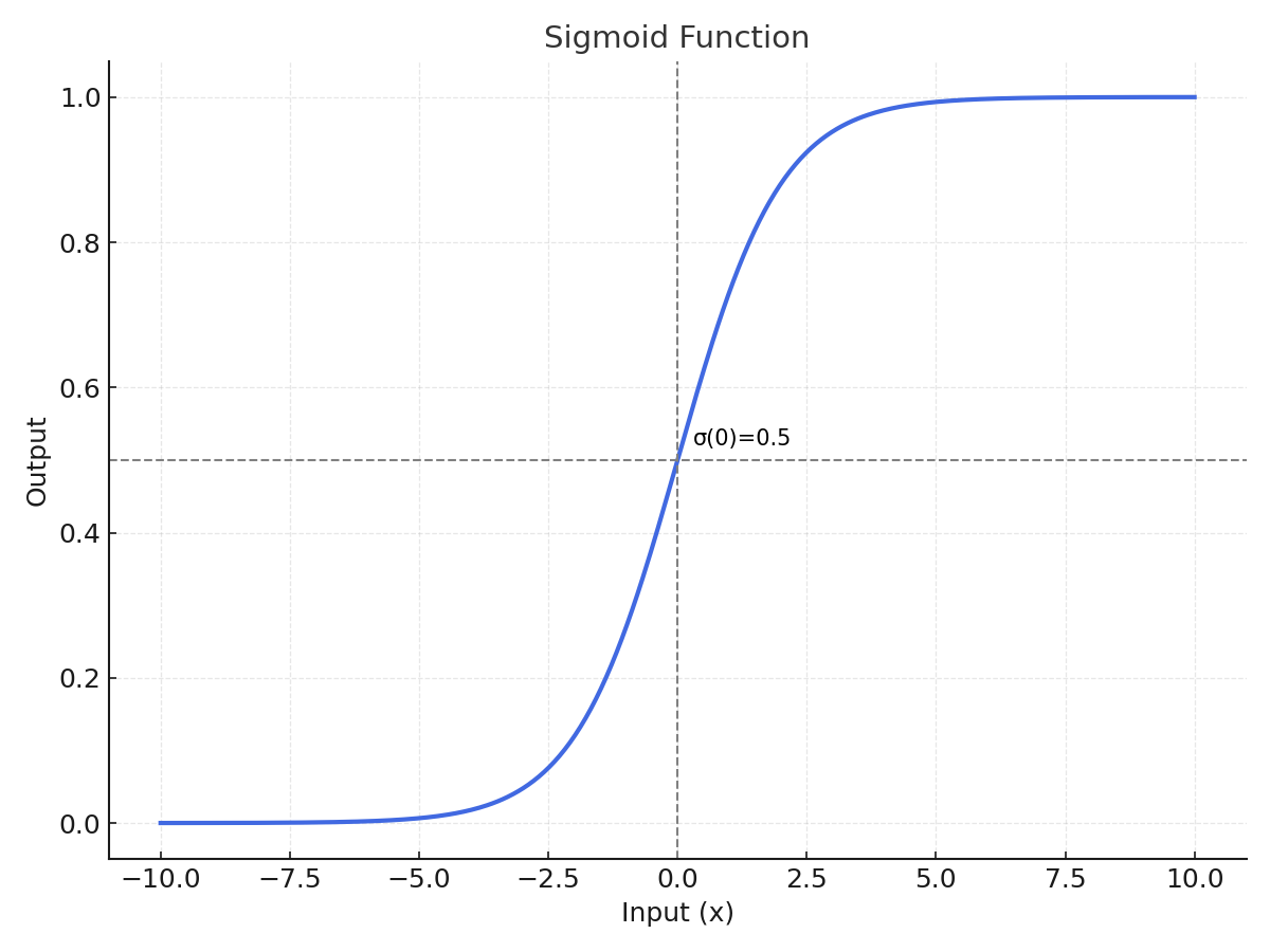
Here, each "Predicted Probability" value typically comes from a sigmoid activation function that converts the model’s raw output into a probability between 0 and 1.
Step 2. Threshold and Classification
A decision threshold determines the cutoff above which a sample is classified as Positive (1).
By default, models often use 0.5, but in ROC analysis, we test every possible threshold between 1.0 and 0.0 (e.g., 1.0, 0.9, 0.8, …, 0.1, 0.0).
-
When the threshold is high (e.g., 0.9): only very confident predictions (stricter) are labeled Positive.
→ Few True Positives (TP), Low FPR, Low TPR
-
When the threshold is low (e.g., 0.2): many predictions are labeled Positive.
→ Many True Positives (TP), but also More False Positives (FP)
As the threshold decreases, the model becomes less strict (more permissive), resulting in a higher TPR but also a higher FPR.
Step 3. Manual Evaluation by Threshold
At each threshold, we classify samples whose probability ≥ threshold as Positive, and others as Negative. We then count the number of TP, FP, TN, and FN to calculate TPR (Recall) and FPR.
| Threshold | Classified as Positive |
TP | FP | FN | TN | TPR \(\frac{TP}{TP + FN}\) |
FPR \(\frac{FP}{FP + TN}\) |
|---|---|---|---|---|---|---|---|
| 1.0 | – | 0 | 0 | 3 | 3 | 0.00 | 0.00 |
| 0.9 | A | 1 | 1 | 2 | 2 | 0.33 | 0.33 |
| 0.8 | A, B, C | 2 | 1 | 1 | 2 | 0.67 | 0.33 |
| 0.7 | A, B, C | 2 | 1 | 1 | 2 | 0.67 | 0.33 |
| 0.6 | A, B, C | 2 | 1 | 1 | 2 | 0.67 | 0.33 |
| 0.5 | A, B, C, D | 2 | 2 | 1 | 1 | 0.67 | 0.67 |
| 0.4 | A, B, C, D | 2 | 2 | 1 | 1 | 0.67 | 0.67 |
| 0.3 | A, B, C, D, E | 3 | 2 | 0 | 1 | 1.00 | 0.67 |
| 0.2 | A, B, C, D, E | 3 | 2 | 0 | 1 | 1.00 | 0.67 |
| 0.1 | A, B, C, D, E, F | 3 | 3 | 0 | 0 | 1.00 | 1.00 |
| 0.0 | A, B, C, D, E, F | 3 | 3 | 0 | 0 | 1.00 | 1.00 |
Step 4. Interpreting the ROC Curve
Each pair of (FPR, TPR) from the table above represents a point on the ROC curve. By connecting these points, we obtain the ROC curve, which shows how the model's sensitivity (TPR) increases as we allow more false positives (FPR).
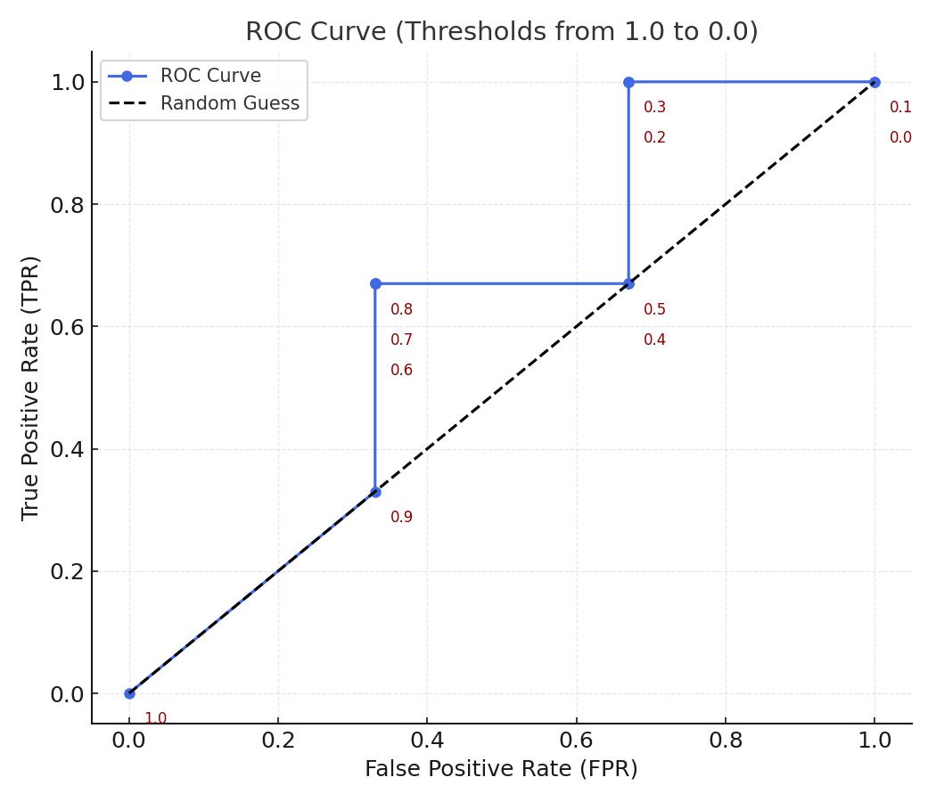
-
At high thresholds (near 1.0): almost no positives are detected (low TPR, low FPR).
-
As the threshold decreases: TPR rises as more positives are found, but FPR also rises because more negatives are incorrectly classified.
-
At threshold = 0: every sample is classified as positive (TPR = 1.0, FPR = 1.0).
Thus, sweeping the threshold from 1.0 to 0.0 gives a full picture of model behavior, independent of any single decision cutoff.
The ROC (Receiver Operating Characteristic) curve shows how well a model distinguishes between positive and negative classes as we vary the decision threshold.
In essence:
The ROC curve visualizes how the model balances true detections (TPR) against false alarms (FPR) across all possible thresholds.
Axes Meaning
| Axis | Formula | Meaning |
|---|---|---|
| x-axis (FPR) | \(FPR = \frac{FP}{FP + TN}\) | The proportion of actual negatives that were incorrectly predicted as positive (False Alarm Rate) |
| y-axis (TPR) | \(TPR = \frac{TP}{TP + FN}\) | The proportion of actual positives that were correctly predicted (Detection Rate) |
Intuitive Interpretation
-
Bottom-left (0, 0) → The model predicts everything as negative. No detections, no false alarms.
-
Top-right (1, 1) → The model predicts everything as positive. All positives are found, but every negative is misclassified.
-
Top-left (0, 1) → Ideal point: High TPR and Low FPR. The closer the curve is to this corner, the better the model.
What is AUC (Area Under the Curve)?
The AUC measures the entire area under the ROC curve. It quantifies the overall ability of the model to distinguish between the positive and negative classes — independent of any specific threshold.
| AUC Value | Interpretation |
|---|---|
| 1.0 | Perfect classifier |
| 0.9 – 1.0 | Excellent |
| 0.8 – 0.9 | Good |
| 0.7 – 0.8 | Fair |
| 0.6 – 0.7 | Poor |
| 0.5 | Random guess |
| < 0.5 | Worse than random |
Intuitively, AUC represents the probability that the model ranks a randomly chosen positive example higher than a randomly chosen negative example.
When to Use ROC–AUC
You can use ROC–AUC when:
-
Your model outputs probability scores (e.g., logistic regression, neural networks).
-
You want to evaluate the ranking ability rather than performance at a single threshold.
-
Your dataset is balanced or moderately imbalanced.
-
You need to compare models fairly across varying thresholds.
Example: In fraud detection, ROC–AUC shows how well the model ranks suspicious transactions above normal ones.
Advantages and Disadvantages
| Category | Description |
|---|---|
| Advantages | - Threshold-free: Evaluates across all possible cutoffs. - Comprehensive: Considers both TPR and FPR. - Intuitive: Directly measures ranking quality. - Comparable: Useful for comparing multiple models. |
| Disadvantages | - Sensitive to imbalance: May look high even when the minority class is poorly detected. - Ignores probability calibration: Only measures rank, not accuracy of predicted probabilities. - Not business-aware: AUC ≈ 0.9 doesn’t guarantee good performance at a specific decision point. |
Python Example
Problem: How can we evaluate a binary classifier beyond accuracy?
In real-world classification problems, simply checking the accuracy of a model can be misleading — especially when the dataset is imbalanced (for example, detecting rare diseases or fraud). A model might achieve 95% accuracy just by always predicting the majority class, but fail to detect the minority class that truly matters.
To properly understand a model’s ability to distinguish between classes, we use the ROC Curve (Receiver Operating Characteristic Curve) and its summary metric, AUC (Area Under the Curve).
Coding Steps
-
Create a simple binary classification dataset.
-
Train a Logistic Regression model.
-
Compute and visualize the ROC Curve.
-
Calculate the AUC to summarize the model’s discrimination ability.
# Example: Plotting ROC Curve and calculating AUC (educational version with detailed comments)

# Import required libraries
from sklearn.datasets import make_classification           # for creating a synthetic dataset
from sklearn.model_selection import train_test_split       # for splitting data into training/testing sets
from sklearn.linear_model import LogisticRegression        # simple classification model
from sklearn.metrics import roc_curve, auc                 # for ROC and AUC calculation
import matplotlib.pyplot as plt                            # for visualization


# Generate a synthetic binary classification dataset
# -----------------------------------------------------
# make_classification parameters:
#   - n_samples: number of data points to generate
#   - n_features: total number of features (input variables)
#   - n_informative: number of features that are actually useful to predict the label
#   - n_redundant: number of redundant (correlated) features
#   - random_state: ensures reproducibility
X, y = make_classification(
    n_samples=500,        # total 500 samples
    n_features=10,        # 10 total input features
    n_informative=5,      # 5 features are truly predictive
    n_redundant=2,        # 2 features are linear combinations of informative ones
    random_state=42       # for consistent results across runs
)


# Split data into training and testing sets
# ---------------------------------------------
# train_test_split parameters:
#   - test_size: proportion of data reserved for testing (0.3 = 30%)
#   - random_state: seed for reproducibility
#   - returns: four arrays → X_train, X_test, y_train, y_test
X_train, X_test, y_train, y_test = train_test_split(
    X, y, test_size=0.3, random_state=42
)


# Train a simple Logistic Regression model
# ---------------------------------------------
# LogisticRegression parameters:
#   - max_iter: maximum number of iterations for optimization convergence
#   - random_state: for reproducibility
model = LogisticRegression(max_iter=1000, random_state=42)
model.fit(X_train, y_train)   # model learns relationships between X_train and y_train


# Predict class probabilities for the test data
# -------------------------------------------------
# predict_proba returns probability estimates for each class:
#   - [:, 0] = probability of class 0 (negative)
#   - [:, 1] = probability of class 1 (positive)
# We take only [:, 1] because ROC curve uses probability of the "positive" class.
y_scores = model.predict_proba(X_test)[:, 1]


# Compute ROC curve values
# -----------------------------
# roc_curve parameters:
#   - y_test: true binary labels
#   - y_scores: model-predicted probabilities (not discrete 0/1 labels)
# returns:
#   - fpr: array of false positive rates
#   - tpr: array of true positive rates
#   - thresholds: corresponding decision thresholds used to compute (fpr, tpr)
fpr, tpr, thresholds = roc_curve(y_test, y_scores)

# auc(fpr, tpr) computes the total "area under the curve" (AUC)
# Higher AUC → better model performance.
roc_auc = auc(fpr, tpr)
print(f"AUC: {roc_auc:.3f}")


# Plot ROC Curve
# -------------------
plt.figure(figsize=(6, 5))
plt.plot(
    fpr, tpr, color="blue", lw=2,
    label=f"Logistic Regression (AUC = {roc_auc:.2f})"
)
plt.plot(
    [0, 1], [0, 1], "k--", lw=1.5, label="Random Guess", alpha=0.6
)

plt.xlabel("False Positive Rate (FPR)", fontsize=11)
plt.ylabel("True Positive Rate (TPR)", fontsize=11)
plt.title("ROC Curve Example", fontsize=13, pad=8)
plt.legend(loc="lower right")
plt.grid(alpha=0.3)
plt.tight_layout()
plt.show()
AUC: 0.904
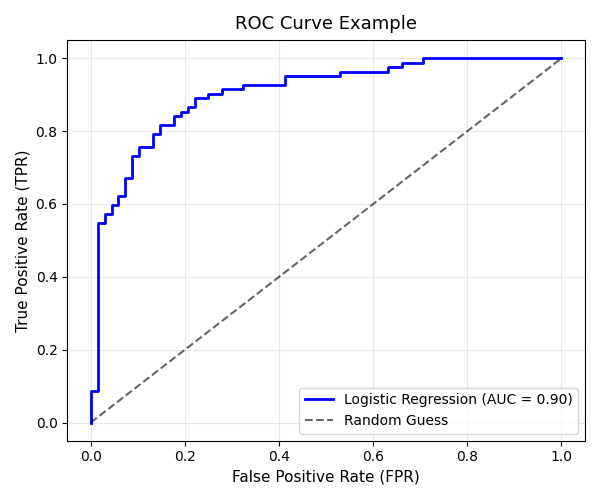
Interpretation
The ROC curve above shows the performance of the Logistic Regression model in distinguishing between positive and negative classes.
1. Curve Shape
-
The blue line represents the model’s true performance.
-
The curve rises sharply toward the top-left corner (0,1), indicating that the model achieves a high True Positive Rate (TPR) while keeping the False Positive Rate (FPR) relatively low.
-
This steep initial rise shows that the classifier is able to correctly detect most positive samples with minimal false alarms.
2. The Dashed Line (Random Guess)
-
The gray dashed line represents a model that guesses randomly (AUC = 0.5).
-
The fact that our ROC curve stays well above this diagonal means the model performs significantly better than random.
3. AUC (Area Under the Curve)
-
The AUC value displayed on the plot is 0.90, meaning there is a 90% chance that the model will correctly rank a randomly chosen positive sample higher than a randomly chosen negative sample.
-
In practice:
-
AUC ≈ 0.9 → Excellent discrimination ability
-
AUC ≈ 0.7–0.8 → Fair model
-
AUC ≈ 0.5 → No discriminative power
-
4. Interpretation in Context
-
This model achieves good balance between sensitivity (Recall) and specificity.
-
If the task involves detecting rare events (e.g., medical conditions, fraud), a high AUC like this implies that the model can effectively distinguish rare positives from common negatives.
5. Summary
| Metric | Observation | Interpretation |
|---|---|---|
| TPR (Sensitivity) | High | The model detects most of the actual positives. |
| FPR (1 - Specificity) | Low | The model rarely misclassifies negatives as positives. |
| AUC = 0.90 | Excellent | The model has strong discriminative power. |
Regression Metrics
In regression tasks, the output variable is continuous — such as house prices, temperature, or sales. Evaluation metrics measure how close the predicted values are to the actual outcomes.
| Metric | Formula | Description |
|---|---|---|
| MAE | \(\dfrac{1}{n} \sum_{i=1}^{n} \lvert y_i - \hat{y}_i \rvert\) | Mean Absolute Error Average magnitude of errors |
| MSE | \(\dfrac{1}{n} \sum_{i=1}^{n} (y_i - \hat{y}_i)^2\) | Mean Squared Error Penalizes larger errors more |
| RMSE | \(\sqrt{MSE}\) | Root Mean Squared Error Interpretable in same units as \(y\) |
| R² | \(1 - \dfrac{SSE}{SST}\) \(SSE = \sum_{i=1}^{n} (y_i - \hat{y}_i)^2\) \(SST = \sum_{i=1}^{n} (y_i - \bar{y})^2\) |
Coefficient of Determination Proportion of total variance explained by the model \(𝑅^2 = 1.0\) → Perfect fit (model explains all variation) \(R^2 = 0\) → Model explains nothing beyond the mean \(𝑅^2 < 0.0\) → Worse than predicting the mean (poor model) |
\(R^2\) Reference
| R² Value | Model Interpretation |
|---|---|
| 1.0 | Perfect prediction (explains all variance) |
| 0.8 ~ 0.9+ | Excellent model — very high explanatory power |
| 0.6 ~ 0.8 | Good level — commonly acceptable in practice |
| 0.4 ~ 0.6 | Moderate — typical when data are noisy or complex |
| 0.2 ~ 0.4 | Weak model — low explanatory power (many uncontrolled factors) |
| < 0.2 | Almost no explanatory power — improvement needed |
| < 0.0 | Worse than predicting the mean — possibly mis-specified model |
Python Example
# Example: Calculating regression metrics
from sklearn.metrics import mean_absolute_error, mean_squared_error, r2_score

# True and predicted continuous values
y_true = [3, -0.5, 2, 7]
y_pred = [2.5, 0.0, 2, 8]

# Compute metrics
mae = mean_absolute_error(y_true, y_pred)
mse = mean_squared_error(y_true, y_pred)
r2 = r2_score(y_true, y_pred)

# Display results
print(f"MAE: {mae:.2f}")
print(f"MSE: {mse:.2f}")
print(f"R²: {r2:.2f}")
Interpretation:
-
MAE: Average absolute error — easy to understand but treats all errors equally.
-
MSE: Penalizes large errors more due to squaring.
-
RMSE: Interpretable in the same units as the target.
-
R²: Indicates how well the model explains variance (1 = perfect, 0 = no better than average).
Model Evaluation in Practice
Real-world model evaluation involves more than a single metric — it’s about testing reliability. Common techniques include splitting data, cross-validation, and stratified sampling.
Train-Test Split
We usually divide the dataset into training and testing subsets. The training set is used to build the model, and the test set evaluates how well it generalizes.
# Example: Splitting data into train and test sets
from sklearn.model_selection import train_test_split

# Suppose X (features) and y (labels) are defined
X_train, X_test, y_train, y_test = train_test_split(
    X, y, test_size=0.2, random_state=42
)

print("Train size:", len(X_train))
print("Test size:", len(X_test))
\(K\)-Fold Cross Validation
Cross-validation is a robust way to measure model performance.
It divides data into k parts, trains the model k times, and uses a different part for testing each time.
Estimate how a model performs on unseen data by rotating the validation role across all parts of the dataset.
A single train–test split can be unstable, because it depends heavily on how the data was divided. K-Fold Cross-Validation (CV) solves this by repeating the process K times — every sample gets to be in the validation set exactly once.
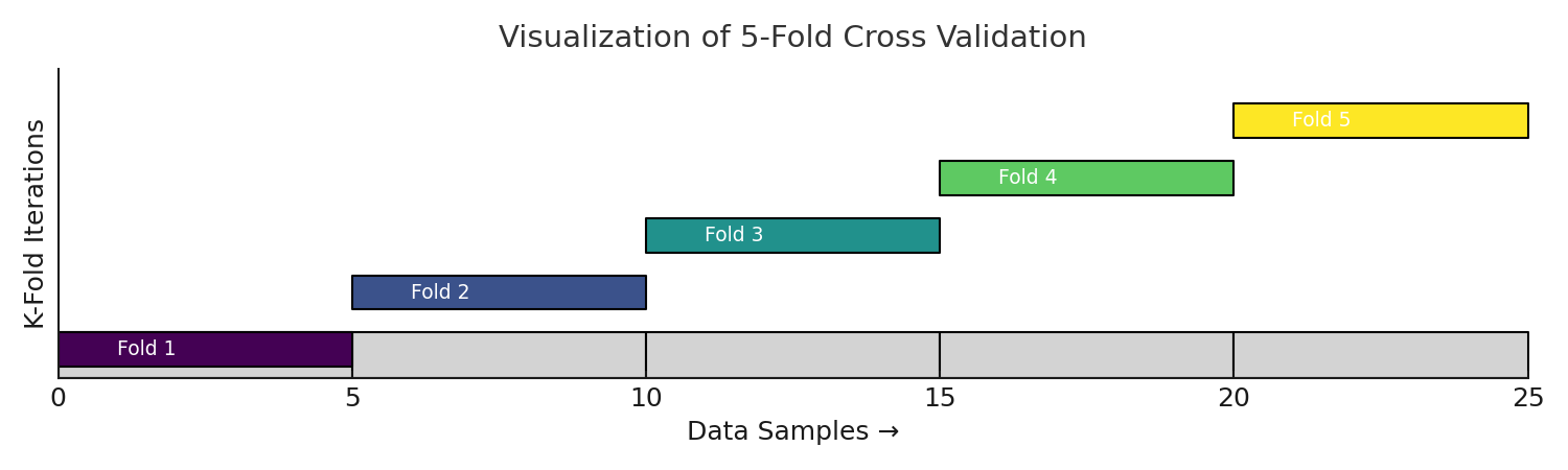
K-Fold Cross Validation (Step-by-Step)
-
Shuffle the dataset (optional but recommended if data are i.i.d.).
-
Split the dataset into \( K \) equal parts (folds): \( D_1, D_2, ..., D_K \).
-
For each fold \( i \in [1, K] \):
-
Use \( D_i \) as the validation set.
-
Use the remaining \( K - 1 \) folds for training.
-
Train the model and compute performance on \( D_i \).
-
-
Aggregate results across all folds: $$ \text{Mean Metric} = \frac{1}{K} \sum_{i=1}^{K} Metric_i $$
Python Example
from sklearn.datasets import make_classification
from sklearn.model_selection import cross_val_score, StratifiedKFold
from sklearn.linear_model import LogisticRegression
import numpy as np

# 1️⃣ Generate toy dataset
X, y = make_classification(
    n_samples=200,
    n_features=5,
    n_informative=2,
    n_redundant=2,
    n_classes=2,
    random_state=42
)

# 2️⃣ Model and cross-validation
model = LogisticRegression(max_iter=200)
cv = StratifiedKFold(n_splits=5, shuffle=True, random_state=42)

scores = cross_val_score(model, X, y, cv=cv, scoring='accuracy')

# 3️⃣ Output
print("Cross-validation scores:", scores)
print("Mean Accuracy:", np.mean(scores).round(3))
print("Standard Deviation:", np.std(scores).round(3))
Results
Cross-validation scores: [0.775    0.875    0.85    0.85    0.9]
Mean Accuracy: 0.85
Standard Deviation: 0.042
Advantages:
-
Reduces variance in evaluation results
-
Makes better use of limited data
-
Provides a more reliable performance estimate
Handling Imbalanced Data
When working with imbalanced data (e.g., 90% negative, 10% positive), simple random splitting may distort class ratios.
Stratified sampling preserves the original proportion of each class.
Stratified Sampling (층하 추출)
Instead of splitting the data completely randomly, we make sure each fold has similar proportions of labels — just like the original dataset.
Easy Example
Imagine your dataset is made of apples (90%) 🍎 and bananas (10%) 🍌.
If you split the data randomly, one fold might accidentally get too many apples and very few bananas.
That would make the validation biased or unfair.
So, in Stratified Sampling,
each fold is built to keep roughly 70% apples and 30% bananas — just like the full dataset.
# Example: Stratified split for imbalanced classification
X_train, X_test, y_train, y_test = train_test_split(
    X, y, test_size=0.3, stratify=y, random_state=42
)
Homeworks
Homework 1 — Classification Metrics Practice
- Using the following data, build a Confusion Matrix and calculate Accuracy, Precision, Recall, and F1-Score.
y_true = [1,0,1,1,0,1,0,1,0,1]
y_pred = [1,0,0,1,0,1,1,1,0,1]
- Interpret each metric in your own words.
Homework 2 — ROC Curve and AUC
- Generate your own probability predictions and plot an ROC Curve.
- Calculate and explain the AUC value — what does it represent about your model?
Homework 3 — Regression Metrics Practice
- For the following data, compute MAE, MSE, and R².
y_true = [3, -0.5, 2, 7]
y_pred = [2.5, 0.0, 2, 8]
- Which metric is more sensitive to large errors? Why?
Homework 4 — Cross Validation
- Use a
LogisticRegressionmodel with 5-fold cross-validation. - Compare the results with a single train-test split and explain the difference.
Summary: Model evaluation is not just about numbers — it’s about understanding what the model does well, where it fails, and how we can improve it. Metrics give us insight, but context gives us meaning.