Data Visualization in ML
- 강의자료 다운로드: click me
Learning Objectives
- Understand why visualization is essential in machine learning.
- Learn how to visualize data distributions, feature relationships, and model performance.
- Practice with matplotlib and seaborn to create intuitive plots.
Why Visualization in Machine Learning?
Visualization is not only for presentation—it is an essential tool in every stage of ML:
- Before training: Explore data, detect outliers, check feature distributions.
- During training: Monitor loss/accuracy curves to diagnose underfitting or overfitting.
- After training: Visualize predictions, confusion matrices, and decision boundaries.
Example: If a dataset has highly imbalanced classes, you can detect it with a simple bar chart before training.
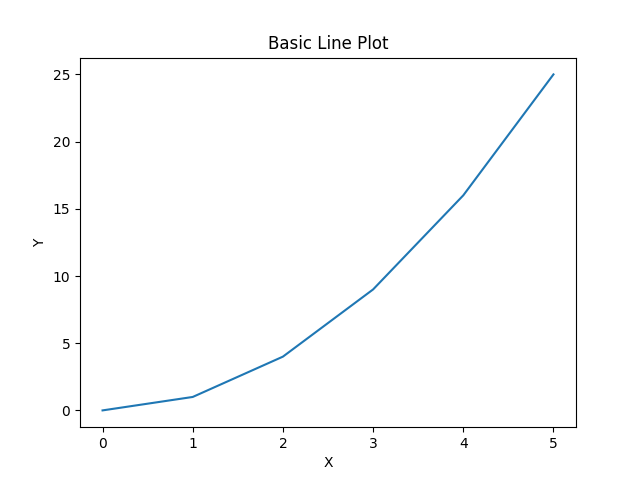
Basic Line Plot
The most basic visualization: connects the relationship between two variables with a straight line.
Used to show changes over time or continuous relationships.
import matplotlib.pyplot as plt

x = [0, 1, 2, 3, 4, 5]
y = [0, 1, 4, 9, 16, 25]

plt.plot(x, y)  # 기본 꺾은선 그래프
plt.title("Basic Line Plot")
plt.xlabel("X")
plt.ylabel("Y")
plt.show()
A line connecting data points. Used to show continuous relationships or changes over time.
More Options
| Option | Example | Description |
|---|---|---|
color |
"red", "g", "#FF5733" |
Sets the line color |
linestyle |
"-", "--", ":", "-." |
Sets the line style |
marker |
"o", "s", "^", "d" |
Sets the marker shape for data points |
linewidth |
2, 3 |
Controls line thickness |
alpha |
0.5 |
Controls transparency (0–1) |
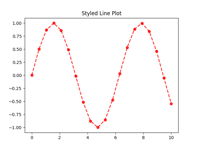
Line Plot with Options
import numpy as np
import matplotlib.pyplot as plt

x = np.linspace(0, 10, 20)
y = np.sin(x)

plt.plot(x, y, color="red", linestyle="--", marker="o", linewidth=2, alpha=0.8)
plt.title("Styled Line Plot")
plt.show()
Visualizing Data Distribution
Necessity of Visualizing Data Distribution
Understanding how data is distributed is a fundamental step in any machine learning workflow. Before applying models, we need to explore the basic characteristics of each feature. By visualizing distributions, we can identify whether the data is balanced or skewed, detect potential outliers, and recognize patterns such as clusters or gaps in the values. These insights help us decide which preprocessing techniques are required, such as normalization, transformation, or outlier handling. Moreover, comparing distributions across different classes allows us to see whether features are informative for classification. Without this step, we risk training models on biased or poorly understood data, which often leads to weak generalization and misleading results.
When Visualization is Used in Machine Learning
Visualization is applied throughout the entire machine learning process, from the very beginning of data exploration to the final evaluation of a trained model. At the start, it is used during exploratory data analysis (EDA) to understand feature distributions, detect missing values, and identify potential outliers. During model training, visualization helps monitor the learning process, such as plotting loss and accuracy curves to detect underfitting or overfitting. After training, it is essential for model evaluation, where tools like confusion matrices, ROC curves, or decision boundaries provide deeper insight into the model’s performance. Visualization is also used for feature interpretation, allowing us to see which features contribute to predictions, and for communicating results effectively to others. In short, visualization is not an optional step but a necessary tool at every stage of machine learning.
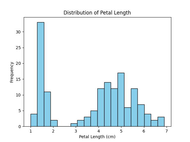
Histogram
import matplotlib.pyplot as plt
from sklearn.datasets import load_iris

# Load dataset
iris = load_iris(as_frame=True)
df = iris.frame

# Plot histogram of petal length
plt.hist(df['petal length (cm)'], bins=20, color='skyblue', edgecolor='black')
plt.title("Distribution of Petal Length")
plt.xlabel("Petal Length (cm)")
plt.ylabel("Frequency")
plt.show()
Excution Result: Histogram
- The histogram shows the distribution of values for a single feature.
- The x-axis represents the range of values (bins), and the y-axis represents the frequency of samples in each bin.
- Peaks in the histogram indicate where values are concentrated, while long tails or isolated bars may suggest outliers.
- In machine learning, histograms are useful for detecting skewness, checking if data needs normalization or transformation, and comparing feature distributions across classes.
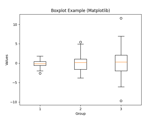
Box Plot
Necessity of Box Plot
Boxplots are essential because they provide a compact summary of data distribution using statistical measures such as the median, quartiles, and potential outliers. Unlike histograms, which require bin selection, boxplots allow quick comparison across multiple groups and highlight variability and skewness in the data. This makes them highly effective for identifying unusual values and understanding overall data spread at a glance.
When Box Plot is Used in Machine Learning
In machine learning, boxplots are commonly used during exploratory data analysis (EDA). They help detect outliers that may negatively affect model training, compare feature distributions across different classes, and evaluate whether data preprocessing (e.g., normalization or transformation) is needed. Boxplots are also useful when assessing model residuals to check if errors are symmetrically distributed or biased toward certain ranges.
import matplotlib.pyplot as plt
import numpy as np

# Example data
np.random.seed(42)
data = [np.random.normal(0, std, 100) for std in range(1, 4)]

# Basic boxplot
plt.boxplot(data)

# An example of customized boxplot
# plt.boxplot(data,
#           notch=True,        # median 주변 신뢰구간 notch 추가
#           vert=True,         # 세로(True)/가로(False) 방향
#           patch_artist=True, # 박스 색칠 가능
#           boxprops=dict(facecolor="lightblue", color="blue"),  # 박스 스타일
#           medianprops=dict(color="red", linewidth=2))          # 중앙선 스타일

plt.title("Boxplot Example (Matplotlib)")
plt.xlabel("Group")
plt.ylabel("Values")
plt.title("Customized Boxplot")
plt.show()
Execution Result: Boxplot
- The box shows the interquartile range (IQR = Q1 to Q3).
- The line inside the box represents the median.
- The whiskers extend to the minimum and maximum values within 1.5 × IQR.
- Points outside the whiskers are considered potential outliers.
- Comparing multiple boxes side by side allows quick detection of group differences.
Visualizing Feature Relationships
Scatter Plot
Necessity of Scatter Plot
Scatter plots are essential because they reveal the relationship between two numerical variables in a direct and intuitive way. They allow us to observe whether there is a linear or nonlinear trend, detect clusters or groupings, and spot anomalies that do not follow the general pattern. Unlike aggregated plots, scatter plots preserve the individuality of each data point, making them indispensable for understanding raw data behavior.
When Scatter Plot is Used in Machine Learning
In machine learning, scatter plots are widely used during exploratory data analysis (EDA) to check feature correlations and separability between classes. They help determine whether certain features are good predictors, as distinct clusters indicate that features may be useful for classification. Scatter plots are also used after dimensionality reduction (e.g., PCA, t-SNE) to visualize high-dimensional data in 2D space, enabling researchers to evaluate how well the algorithm captures data structure.
import matplotlib.pyplot as plt
import numpy as np

# Example data
np.random.seed(0)
x = np.random.rand(50)   # 0~1 사이 난수 50개
y = np.random.rand(50)

# Scatter plot with options
colors = np.random.rand(50)   # Color array
sizes = 100 * np.random.rand(50)  # Size array

# Basic scatter plot
plt.scatter(x, y)
plt.title("Basic Scatter Plot")
plt.xlabel("X values")
plt.ylabel("Y values")
plt.show()

# Scatter Plot with Custom Style
# plt.scatter(x, y, c=colors, s=sizes, alpha=0.7, cmap="viridis", edgecolors="black")
# plt.title("Customized Scatter Plot")
# plt.xlabel("X values")
# plt.ylabel("Y values")
# plt.colorbar(label="Color Scale")
# plt.show()
Execution Result: Scatter Plot
- Each point represents a data sample.
- The x-axis and y-axis correspond to two selected features.
- The pattern of points may reveal correlation (positive, negative, or none).
- Different colors or markers can represent different classes.
- Outliers appear as isolated points far from the main cluster.
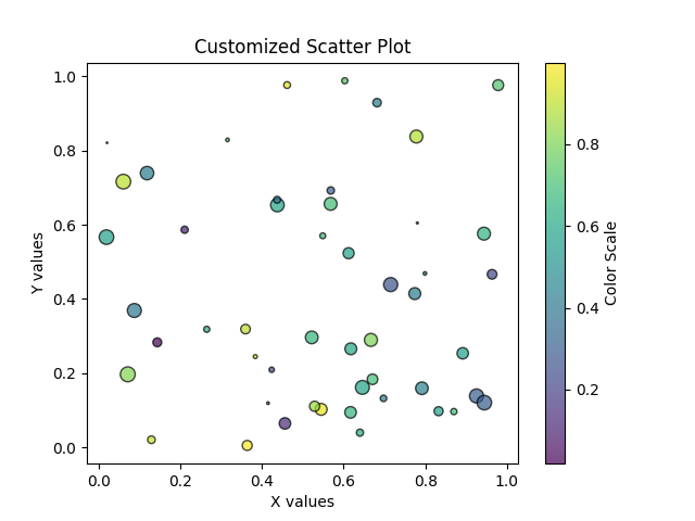
Simple Scatter Plot
Simple Scatter Plot with Customization
-
Common Options for
plt.scatter()Parameter Description Example x, yData coordinates for points plt.scatter(x, y)cColor(s) of points (single value or array) plt.scatter(x, y, c="red")cmapColormap when cis an arrayplt.scatter(x, y, c=z, cmap="viridis")sMarker size (single value or array) plt.scatter(x, y, s=50)markerShape of markers (e.g., "o","s","^")plt.scatter(x, y, marker="^")alphaTransparency (0 = invisible, 1 = solid) plt.scatter(x, y, alpha=0.5)edgecolorsColor of marker edges plt.scatter(x, y, edgecolors="black")linewidthsThickness of marker edge plt.scatter(x, y, edgecolors="black", linewidths=2)labelLabel for legend plt.scatter(x, y, label="Group A")
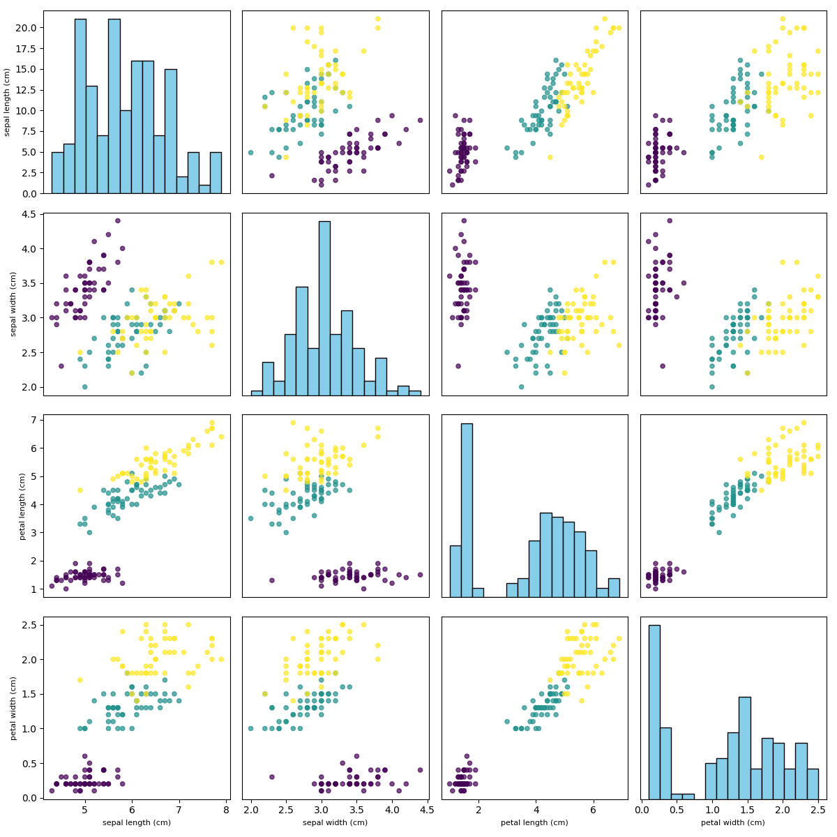
Pairplot
Necessity of Pairplot
Pairplots are essential because they provide a comprehensive view of how multiple features relate to each other at once. By showing both the distribution of individual features (on the diagonal) and the relationships between feature pairs (off-diagonal), pairplots make it easy to detect correlations, clusters, and patterns across the dataset. This holistic visualization helps uncover hidden structures that would be missed by examining features in isolation.
When Pairplot is Used in Machine Learning
In machine learning, pairplots are used during exploratory data analysis (EDA) to evaluate how features interact and whether they can separate different classes. They are especially useful in small to medium-sized datasets, such as Iris, where we want to visually check feature importance and class separability. Pairplots are also applied before feature selection or dimensionality reduction, helping practitioners identify redundant features and potential nonlinear relationships that might influence model design.
import matplotlib.pyplot as plt
import pandas as pd
from sklearn.datasets import load_iris

# Load Iris dataset
iris = load_iris(as_frame=True)
df = iris.frame

features = ["sepal length (cm)", "sepal width (cm)",
            "petal length (cm)", "petal width (cm)"]
target = df["target"]

# Number of features
n = len(features)

fig, axes = plt.subplots(n, n, figsize=(12, 12))

for i in range(n):
    for j in range(n):
        ax = axes[i, j]
        if i == j:
            # Diagonal: histogram
            ax.hist(df[features[i]], bins=15, color="skyblue", edgecolor="black")
        else:
            # Off-diagonal: scatter plot
            scatter = ax.scatter(df[features[j]], df[features[i]],
                                 c=target, cmap="viridis", s=20, alpha=0.7)
        if i == n-1:
            ax.set_xlabel(features[j], fontsize=8)
        else:
            ax.set_xticks([])
        if j == 0:
            ax.set_ylabel(features[i], fontsize=8)
        else:
            ax.set_yticks([])

plt.tight_layout()
plt.show()
Execution Result: Pairplot
- Diagonal plots: show the distribution of each feature (often histograms).
- Off-diagonal plots: show scatter plots of feature pairs.
- Color coding: indicates class membership, helping assess separability.
- Cluster patterns: reveal whether certain features group naturally.
- Overlaps: suggest features may not fully distinguish between classes.
Visualizing Model Training
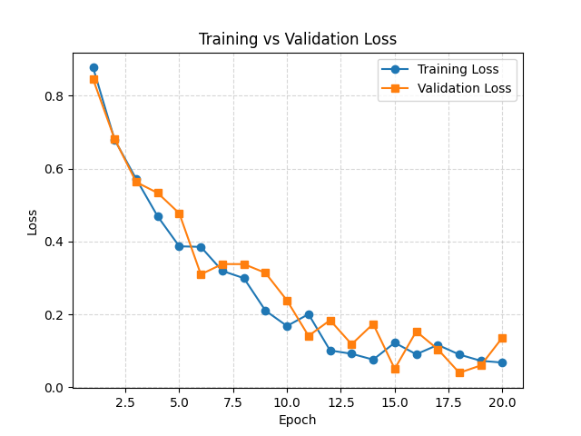
Loss Curves
A loss curve shows how the model’s error changes during the training process. It plots the loss values against the number of epochs, allowing us to observe whether the model is learning effectively. A steadily decreasing training loss indicates that the model is fitting the data, while the validation loss reflects how well the model generalizes to unseen data. When both losses decrease together, it suggests good learning. However, if the validation loss begins to rise while training loss continues to fall, this indicates overfitting. On the other hand, if both losses remain high without improvement, the model may be underfitting or the learning setup may not be appropriate. Thus, loss curves are a critical diagnostic tool to monitor training progress and guide adjustments in hyperparameters, model architecture, or data preprocessing.
Necessity of Loss Curves
Loss curves are essential because they provide direct insight into how well a model is learning over time. By tracking the loss across training epochs, we can determine whether the model is converging, overfitting, or underfitting. Without loss curves, it is difficult to judge if the optimization process is stable and whether the chosen hyperparameters, such as learning rate or regularization, are appropriate.
When Loss Curves are Used in Machine Learning
In machine learning, loss curves are used during model training and evaluation. They are plotted to monitor training progress and detect problems early, such as divergence or plateauing. Comparing training and validation loss helps determine whether the model generalizes well:
- If validation loss decreases together with training loss → good learning.
- If validation loss increases while training loss decreases → overfitting.
- If both losses remain high → underfitting.
import matplotlib.pyplot as plt
import numpy as np

# Simulated loss values for 20 epochs
epochs = np.arange(1, 21)
train_loss = np.exp(-epochs/5) + 0.1 * np.random.rand(20)   # decreasing trend
val_loss = np.exp(-epochs/5) + 0.15 * np.random.rand(20)    # validation with noise

# Plot curves
plt.plot(epochs, train_loss, label="Training Loss", marker="o")
plt.plot(epochs, val_loss, label="Validation Loss", marker="s")

# Add labels and title
plt.xlabel("Epoch")
plt.ylabel("Loss")
plt.title("Training vs Validation Loss")
plt.legend()
plt.grid(True, linestyle="--", alpha=0.5)
plt.show()
Execution Result: Loss Curves
- Training loss decreases steadily if the model is fitting the data.
- Validation loss indicates generalization to unseen data.
- Gap between training and validation loss reveals overfitting.
- Flat curves suggest poor learning or too low learning rate.
- Rapid oscillations may indicate instability or too high learning rate.
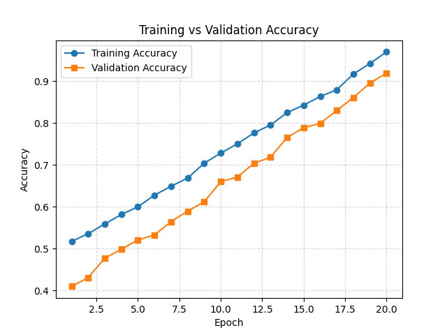
Accuracy Curves
Accuracy is one of the most fundamental evaluation metrics for classification models. It measures the proportion of correctly predicted samples out of the total number of samples. In other words, it reflects how often the classifier makes the right prediction. While accuracy is simple and intuitive, it may not always be reliable for imbalanced datasets, where certain classes dominate the data.
or equivalently,
-
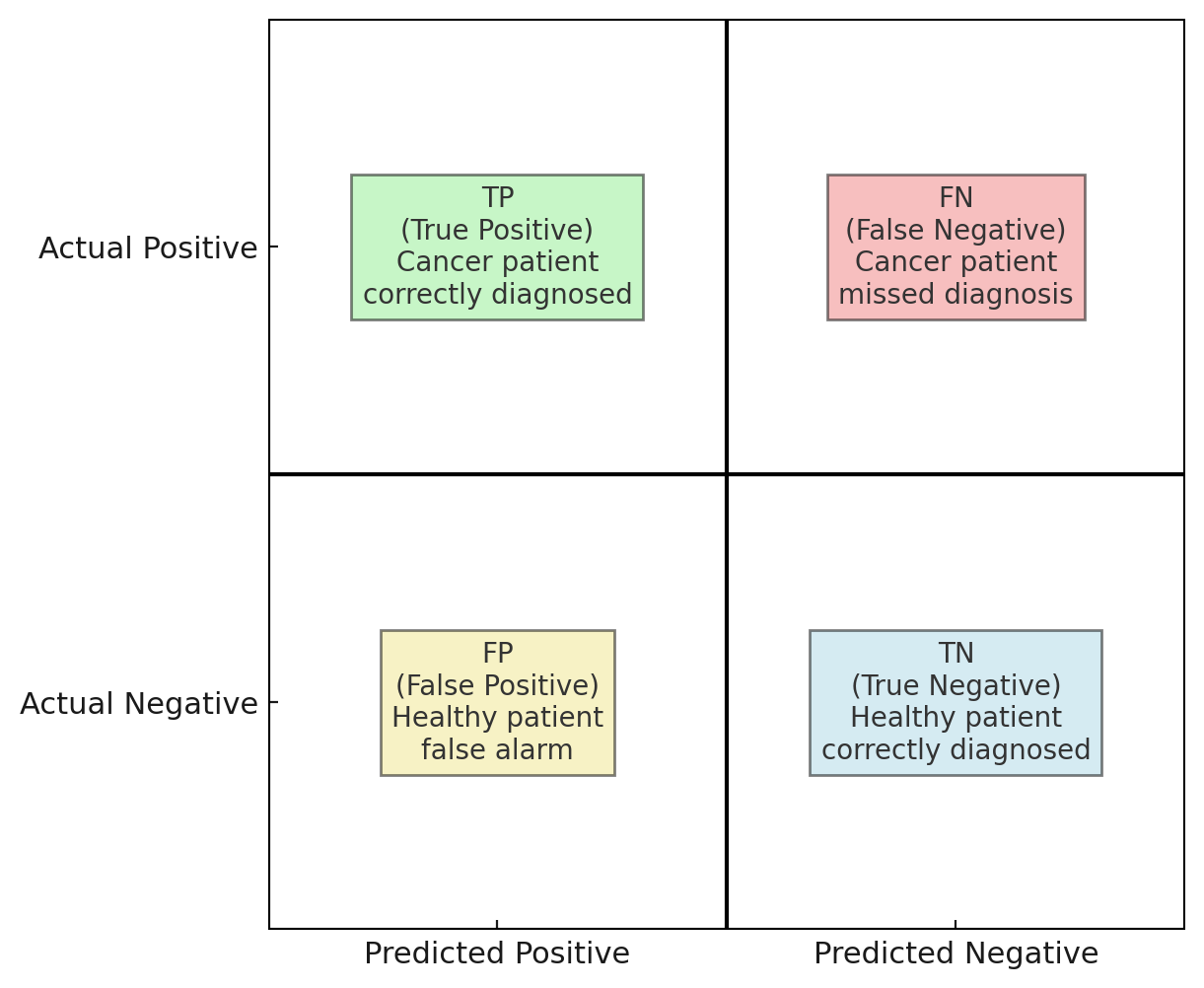
TP: True PositivesThe patient actually has cancer and the test correctly predicts cancer. → Example: A patient with cancer is correctly identified by the test.
-
TN: True NegativesThe patient does not have cancer and the test correctly predicts no cancer. → Example: A healthy patient is correctly identified as healthy.
-
FP: False PositivesThe patient does not have cancer, but the test incorrectly predicts cancer. → Example: A healthy patient is mistakenly told they might have cancer (false alarm).
-
FN: False NegativesThe patient actually has cancer, but the test incorrectly predicts no cancer. → Example: A patient with cancer is mistakenly told they are healthy (missed diagnosis).
Necessity of Accuracy Curves
Accuracy curves are essential because they show how well a model classifies data during training and validation over time. They complement loss curves by providing a more interpretable metric — the proportion of correct predictions. Monitoring accuracy curves helps ensure that the model is not only minimizing loss but also improving prediction performance.
When Accuracy Curves are Used in Machine Learning
In machine learning, accuracy curves are used during training and evaluation of classification models. They help check whether the model is improving as epochs progress and whether it generalizes to unseen data. A rising training accuracy with stagnant or declining validation accuracy indicates overfitting, while low accuracy for both suggests underfitting. Accuracy curves are also used to compare different models or training strategies to decide which setup yields better generalization.
import matplotlib.pyplot as plt
import numpy as np

# Simulated accuracy values for 20 epochs
epochs = np.arange(1, 21)
train_acc = np.linspace(0.5, 0.95, 20) + 0.02 * np.random.rand(20)  # increasing trend
val_acc = np.linspace(0.4, 0.9, 20) + 0.03 * np.random.rand(20)     # validation with noise

# Plot curves
plt.plot(epochs, train_acc, label="Training Accuracy", marker="o")
plt.plot(epochs, val_acc, label="Validation Accuracy", marker="s")

# Add labels and title
plt.xlabel("Epoch")
plt.ylabel("Accuracy")
plt.title("Training vs Validation Accuracy")
plt.legend()
plt.grid(True, linestyle="--", alpha=0.5)
plt.show()
Execution Result: Accuracy Curves
- Training accuracy increases as the model learns patterns in the training data.
- Validation accuracy reflects performance on unseen data.
- Parallel rise of both curves indicates effective learning.
- Large gap between curves suggests overfitting.
- Flat or low curves point to underfitting or insufficient model complexity.
Visualizing Model Performance
Confusion Matrix
A confusion matrix is a table used to evaluate the performance of a classification model. It compares the predicted class labels with the actual labels, showing not only the number of correct predictions but also the types of errors the model makes. This provides a more detailed understanding of model performance than accuracy alone.
The confusion matrix is especially important for imbalanced datasets, where one class occurs much more frequently than the other. In such cases, accuracy may be misleading, but the confusion matrix reveals class-specific performance.
Necessity of Confusion Matrix
A confusion matrix is essential because it provides a detailed view of a classifier’s performance beyond overall accuracy. It shows exactly how many predictions fall into each true–predicted category, making it possible to identify specific types of errors. For example, a model may achieve high accuracy but still misclassify certain classes frequently, which would be hidden without the confusion matrix.
When Confusion Matrix is Used in Machine Learning
In machine learning, confusion matrices are used after training a classification model to evaluate its performance on test data. They are particularly useful for imbalanced datasets, where accuracy alone may be misleading. Practitioners use confusion matrices to calculate additional metrics such as precision, recall, and F1-score, which provide a more complete understanding of model behavior.
import matplotlib.pyplot as plt
from sklearn.datasets import load_iris
from sklearn.model_selection import train_test_split
from sklearn.linear_model import LogisticRegression
from sklearn.metrics import confusion_matrix, ConfusionMatrixDisplay

# Load dataset
iris = load_iris(as_frame=True)
X = iris.data
y = iris.target

# Train-test split
X_train, X_test, y_train, y_test = train_test_split(X, y, test_size=0.3, random_state=42)

# Train a simple classifier
clf = LogisticRegression(max_iter=200)
clf.fit(X_train, y_train)

# Predictions
y_pred = clf.predict(X_test)

# Confusion Matrix
cm = confusion_matrix(y_test, y_pred, labels=clf.classes_)

# Display with Matplotlib
disp = ConfusionMatrixDisplay(confusion_matrix=cm, display_labels=iris.target_names)
disp.plot(cmap="Blues")
plt.title("Confusion Matrix")
plt.show()
Execution Result: Confusion Matrix
- Diagonal values → correctly classified samples.
- Off-diagonal values → misclassified samples.
- Rows → true class labels.
- Columns → predicted class labels.
- Helps to detect class-specific weaknesses (e.g., frequent misclassification between two similar classes).
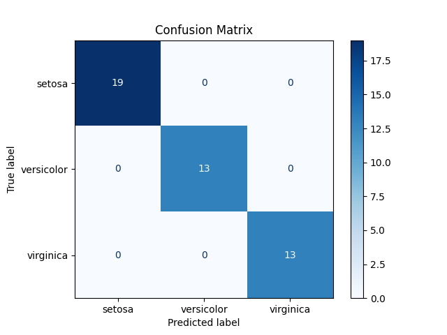
The execution result of the confusion matrix provides a detailed breakdown of how the model’s predictions compare to the actual outcomes. The diagonal elements of the matrix represent correct classifications: true positives indicate cases where the model successfully identifies positive instances (e.g., cancer patients correctly diagnosed), while true negatives indicate correctly identified negative instances (e.g., healthy patients correctly classified as healthy). These values show the model’s strengths in recognizing classes accurately.
On the other hand, the off-diagonal elements highlight the model’s mistakes. False positives occur when the model incorrectly predicts a positive outcome for a negative case, which in medical diagnosis may cause unnecessary stress or costly additional tests. False negatives are even more critical, as they represent cases where a positive instance is misclassified as negative, such as a patient with cancer being told they are healthy. This type of error can have severe real-world consequences.
By examining the confusion matrix, we gain more than just an overall accuracy score — we understand which types of errors the model is prone to and how those errors might impact practical applications. For instance, in healthcare, reducing false negatives is often prioritized over minimizing false positives, since missing a diagnosis can be far more dangerous than raising a false alarm.
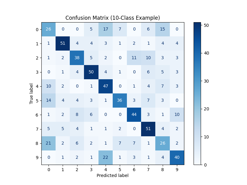
Imbalance Dataset Example
import numpy as np
import matplotlib.pyplot as plt
from sklearn.datasets import make_classification
from sklearn.model_selection import train_test_split
from sklearn.linear_model import LogisticRegression
from sklearn.metrics import confusion_matrix, ConfusionMatrixDisplay, classification_report

# 1) Create a 10-class dataset
X, y = make_classification(
    n_samples=3000,
    n_features=15,
    n_informative=10,
    n_redundant=2,
    n_classes=10,
    n_clusters_per_class=1,
    random_state=42
)

# 2) Train-test split
X_train, X_test, y_train, y_test = train_test_split(
    X, y, test_size=0.25, stratify=y, random_state=42
)

# 3) Train a classifier
clf = LogisticRegression(max_iter=2000, multi_class="multinomial", solver="lbfgs")
clf.fit(X_train, y_train)
y_pred = clf.predict(X_test)

# 4) Compute confusion matrix
cm = confusion_matrix(y_test, y_pred)

# 5) Plot confusion matrix
fig, ax = plt.subplots(figsize=(8, 6))
disp = ConfusionMatrixDisplay(confusion_matrix=cm, display_labels=np.arange(10))
disp.plot(ax=ax, cmap="Blues", colorbar=True, values_format="d")
plt.title("Confusion Matrix (10-Class Example)")
plt.show()

# 6) Print classification report
print("Classification Report (per-class precision/recall/F1):")
print(classification_report(y_test, y_pred))
Interpretation
- With 10 classes, the confusion matrix is a 10×10 grid.
- Diagonal values → correctly classified samples for each class.
- Off-diagonal values → misclassifications, showing which classes get confused with each other.
- This helps students see that accuracy alone may not explain which classes are “harder” to classify.
- The classification report complements the confusion matrix by providing precision, recall, and F1-score for each class, which is crucial when some classes are systematically harder to predict.
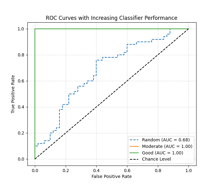
ROC Curve
Necessity of ROC Curve
The ROC (Receiver Operating Characteristic) curve is essential because it shows the trade-off between sensitivity (true positive rate) and specificity (1 – false positive rate) across different classification thresholds. Unlike accuracy, which depends on a single threshold, the ROC curve provides a more comprehensive evaluation of a classifier’s ability to separate classes. It is particularly useful when dealing with imbalanced datasets or when the cost of false positives and false negatives must be compared.
When ROC Curve is Used in Machine Learning
In machine learning, ROC curves are used after training a binary classifier (and extended to multiclass with one-vs-rest methods). They are applied when evaluating how well the model distinguishes between positive and negative classes under varying thresholds. ROC curves are also widely used in model comparison: a model with a curve closer to the top-left corner or with a higher AUC (Area Under Curve) is considered better.
import matplotlib.pyplot as plt
from sklearn.metrics import roc_curve, auc
import numpy as np

# Example binary labels
y_true = np.array([0]*50 + [1]*50)  # 50 negatives, 50 positives

# Simulated prediction scores
y_score_random   = np.random.rand(100)               # random predictions
y_score_medium   = np.linspace(0.2, 0.8, 100)        # moderate separation
y_score_good     = np.concatenate([np.linspace(0,0.3,50), np.linspace(0.7,1,50)])  # good separation

# Compute ROC curves
fpr_r, tpr_r, _ = roc_curve(y_true, y_score_random)
fpr_m, tpr_m, _ = roc_curve(y_true, y_score_medium)
fpr_g, tpr_g, _ = roc_curve(y_true, y_score_good)

# Compute AUC
auc_r = auc(fpr_r, tpr_r)
auc_m = auc(fpr_m, tpr_m)
auc_g = auc(fpr_g, tpr_g)

# Plot
plt.figure(figsize=(7,6))
plt.plot(fpr_r, tpr_r, label=f"Random (AUC = {auc_r:.2f})", linestyle="--")
plt.plot(fpr_m, tpr_m, label=f"Moderate (AUC = {auc_m:.2f})")
plt.plot(fpr_g, tpr_g, label=f"Good (AUC = {auc_g:.2f})")
plt.plot([0,1],[0,1],"k--", label="Chance Level")
plt.xlabel("False Positive Rate")
plt.ylabel("True Positive Rate")
plt.title("ROC Curves with Increasing Classifier Performance")
plt.legend()
plt.grid(True, linestyle="--", alpha=0.5)
plt.show()
Execution Result: ROC Curve
- X-axis → False Positive Rate (FPR).
- Y-axis → True Positive Rate (TPR).
- Diagonal line → random guessing baseline (AUC = 0.5).
- Curve closer to the top-left corner → stronger classifier.
- AUC value quantifies the overall ability:
- 0.0 ~ 0.5 = no discrimination (random).
- 0.7 ~ 0.8 = acceptable.
- 0.8 ~ 0.9 = excellent.
- 0.9 ~ 1.0 = outstanding.
Advanced Visualizations
Decision Boundary
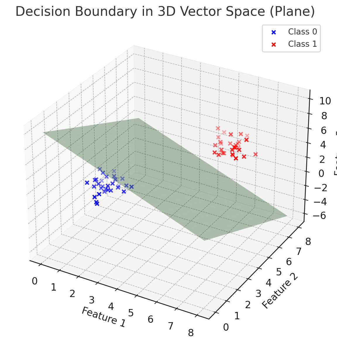
In machine learning, a decision boundary is the surface that separates different classes in the feature space. While in 2D we can visualize it as a line, and in 3D as a plane or curved surface, in higher dimensions it becomes a (d–1)-dimensional hypersurface that we cannot directly see.
-
Data as vectors
Each data point can be represented as a vector in an \(n\)-dimensional space, where \(n\) is the number of features. For example, if a sample has 100 features, it corresponds to a vector in \(\mathbb{R}^{100}\).
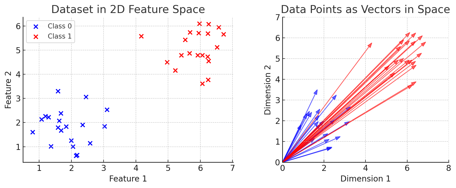
-
Decision boundary as a hypersurface
A classifier divides this space into regions. The boundary between regions is a hypersurface where the model is uncertain (e.g., predicted probability is 0.5 for binary classification).
-
Linear models (e.g., logistic regression, linear SVM) → boundaries are hyperplanes.
-
Nonlinear models (e.g., decision trees, kernel SVM, neural networks) → boundaries can be highly curved and complex.
-
-
Interpretation
Even though we cannot visualize beyond 3D, the same principles apply:
-
Each side of the decision boundary corresponds to one class.
-
The closer a point is to the boundary, the less confident the model is.
-
Misclassified points typically lie near or across the wrong side of the boundary.
-
-
Why it matters in ML:
-
Understanding decision boundaries helps explain model capacity:
-
Simple models (linear) → smooth, straight boundaries → good for linearly separable data.
-
Complex models (deep nets, ensembles) → flexible, nonlinear boundaries → better for complex patterns but prone to overfitting.
-
-
In practice, techniques like dimensionality reduction (PCA, t-SNE, UMAP) are used to project high-dimensional decision boundaries into 2D/3D for visualization.
-
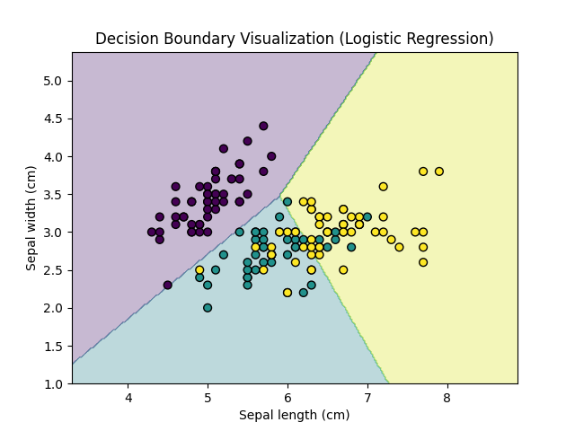
Necessity of Decision Boundary
Decision boundary visualization is essential because it helps us understand how a classifier separates different classes in the feature space. It provides a clear, intuitive picture of the regions where the model assigns predictions, making it easier to identify whether the model is overfitting, underfitting, or failing to separate classes properly.
When Decision Boundary is Used in Machine Learning
In machine learning, decision boundaries are mainly used in classification tasks with two or three features where visualization is possible. They are helpful in teaching and model interpretation, as they show how algorithms such as logistic regression, SVMs, or decision trees divide the input space. They are also used when comparing different classifiers to evaluate how each model partitions the data.
import matplotlib.pyplot as plt
import numpy as np
from sklearn.datasets import load_iris
from sklearn.linear_model import LogisticRegression

# Load dataset
iris = load_iris()
X = iris.data[:, :2]   # Use only first two features (sepal length, sepal width)
y = iris.target

# Train classifier
clf = LogisticRegression(max_iter=200)
clf.fit(X, y)

# Create mesh grid
x_min, x_max = X[:, 0].min() - 1, X[:, 0].max() + 1
y_min, y_max = X[:, 1].min() - 1, X[:, 1].max() + 1
xx, yy = np.meshgrid(np.arange(x_min, x_max, 0.02),
                     np.arange(y_min, y_max, 0.02))

# Predict class for each grid point
Z = clf.predict(np.c_[xx.ravel(), yy.ravel()])
Z = Z.reshape(xx.shape)

# Plot decision boundary
plt.contourf(xx, yy, Z, alpha=0.3, cmap=plt.cm.viridis)
plt.scatter(X[:, 0], X[:, 1], c=y, cmap=plt.cm.viridis, edgecolor="k", s=40)

plt.xlabel("Sepal length (cm)")
plt.ylabel("Sepal width (cm)")
plt.title("Decision Boundary Visualization (Logistic Regression)")
plt.show()
Execution Result: Decision Boundary
- Colored regions → areas where the model predicts a specific class.
- Scatter points → actual data samples, colored by their true labels.
- Smooth or linear boundaries → indicate simple models (e.g., logistic regression).
- Irregular boundaries → indicate more complex models (e.g., decision trees).
- Misclassified points appear inside the wrong region, showing model weaknesses.
(End of Document)